1.
The key conventions that help identify the print
text are the age ratings as they are shown 6 times in total on all sides of the
DVD cover; another key convention is a short paragraph/summary of what the film
is about is written on the back with little images of what the viewer would
find in the film.
2.
There are many design features which help
identify the ill manors brand, such as the gun which is portrayed in 4 images
and is at the forefront of the front cover, which in turn shows the violent
nature of the Ill Manors brand. The council estate in the background also helps
identify the ill manors brand as the story is about people who are from council
estate and the buildings are also curving around the main actor at the front to
portray that people are trapped in this dark society which is a poor council
estate.
3.
You can find examples of synergy as on the back
cover it says ‘Featuring New Music By Plan B’, which is an example of synergy
as it uses the music/album to help promote the film, and the film to help
promote the music.

1.
The key conventions that help the viewer
identify that it is a print text is the use of promoting that the film is
available on Blu-ray, DVD, Download and is on-demand. Also the use of showing
the social network site pages, also helps show that it is a print text as the
whole purpose of a print text is to promote the film further and this print
does just that.
2.
The design features are used all identify the ill
manors brand as ill manors is a low budget film and relies significantly on the
traditional advertising means such as word of mouth, which has worked
successfully with ill manors. This is shown as 17 quotes, phrases, words, by
media leaders are used to describe ill manors are shown on this poster.
3.
On this print text you cannot see any synergy
being shown, as it is mainly based around and only on the film.
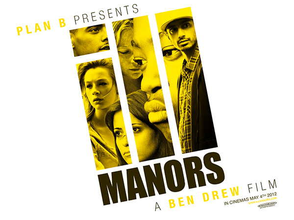
1.
The key conventions used to help the audience identify
that this is a print text is the release date at the bottom right hand corner
and the distribution company logo which is also shown.
2.
The design features which enable the audience to
identify the brand of ill manors is the font of the writing as it is the same
across all platforms, also as much as the title is consistent, so is Plan B’s
stage name and real name, which also portrays that the brand of ill manors is significantly
related to Plan B, therefore the audience then relate the brand to him.
3.
You cannot see any synergy being shown, as it is
mainly based around and only on the film.
No comments:
Post a Comment